Foodora Design System

Foodora’s design system allowed the team to scale up faster and streamline design and development. By creating rules and reusable components, we are able to design with consistency, apply changes faster, and onboard new brands to the platform.
—
If you take a look at an product that has been experiencing hypergrowth recently, it is quite likely that you will find many inconsistencies in the experience and UI.
At some point after Foodora’s merge with Foodpanda and later with Online Pizza Sweden, there was no source of truth to what each screen across each platform in the product looked like. Everything from colors, to text styles, navigation patterns or icons needed to be consolidated.
The entire design team went on a week-long offsite dedicated to stepping back, mapping the existing product entirely, and then coming up with a simple redefinition of its components.
Each team member tackled then on their own one component set. I was responsible for the navigation components — a set that had gone quite wild, is often tricky to customize and develop on mobile, and requires a lot of strategic thinking to come up with a one-catch-all solution that is also flexible.
DS Team:
6 designers
DS Libraries:
1 designer
Implementation:
1 designer, 1 developer per platform
6 designers
DS Libraries:
1 designer
Implementation:
1 designer, 1 developer per platform
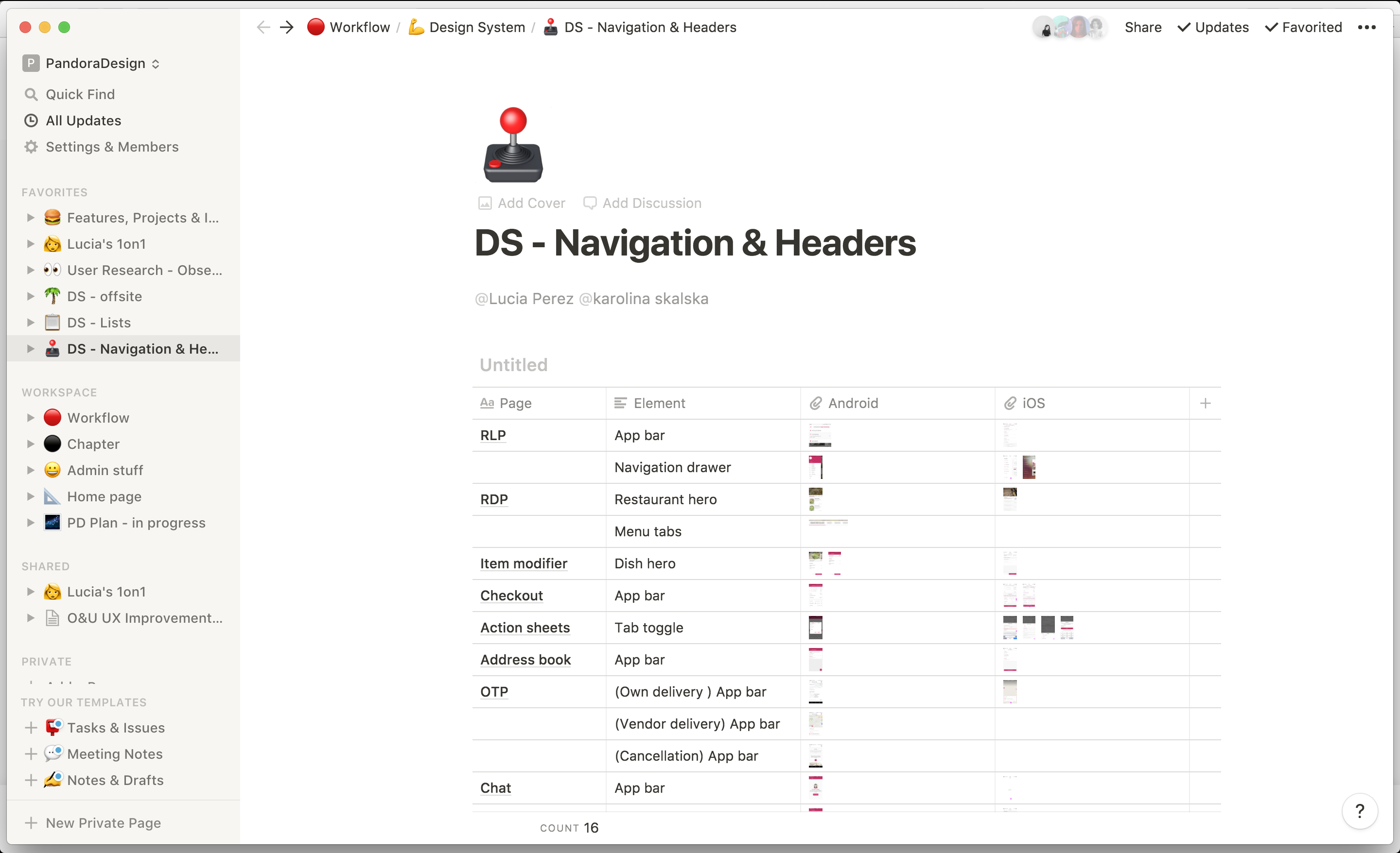 Mapping and documentation on Notion
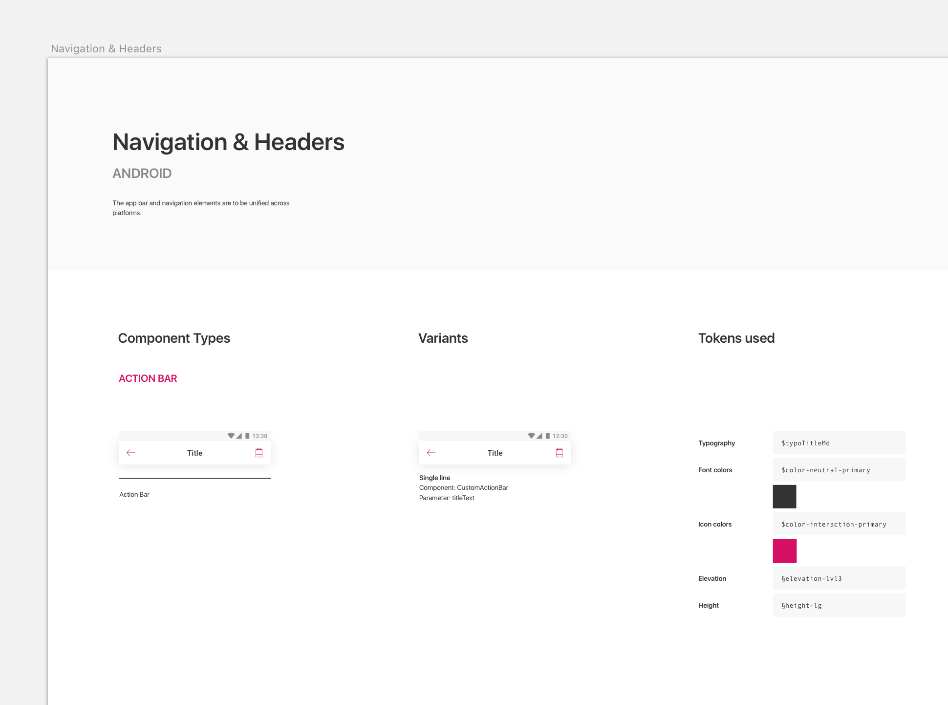 Library: My Sketch library has reusable components and explains the smaller tokens (atoms) used, as well as the variants of a component.
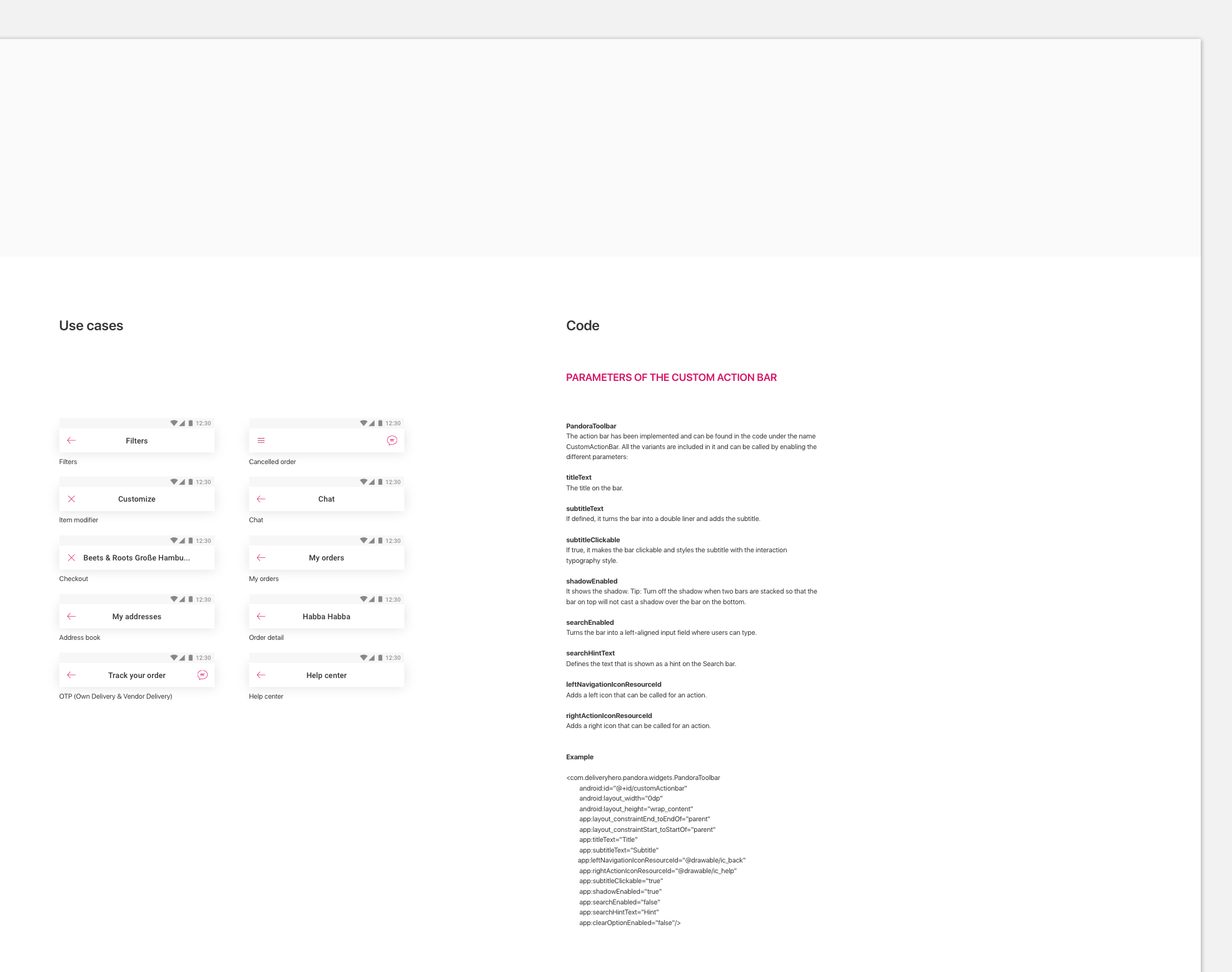
Implementation: Because of my understanding of Android code, I was able to align very closely with an Android developer and put together a beautiful piece of code with custom parameters to use as the new unified action bar for all of the product’s screens.