Find me a home
In depth case study: Find me a home, An app started in a hackathon that now has 200+ organic users. WINNER PROJECT — 1ST PRIZE MYOUTH HACKATHON SPAIN — FINALIST EUROPEAN YOUTH AWARD
—
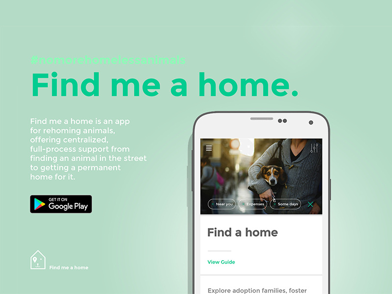
An Android app for rehoming animals
Created by two backend/Android developers and me as the only designer.
What I did:
—
An Android app for rehoming animals
Created by two backend/Android developers and me as the only designer.
What I did:
- product design
- UX design
- UX research
- UI design
- illustration
- interface development (XML & asset management in Android Studio)
- content creation
- web
- branding
- campaign
Co-founders:
Lucia Tahan, Juan Antonio Cobos, Juan Jesus Cilla
Design:
Lucia Tahan
Development:
Lucia Tahan. Juan Antonio Cobos, Juan Jesus Cilla
Download Find me a home for Android — Google Play Store
Official website — findmeahome.org
Github repository — github.com
Publication — cafebabel.co.uk
Interview winner projects — mYouth.com
Index
01 Product design: The app screens and functions
02 The design process: Prototypes
03 UX research/design case study: An appealing user flow to create a new listing
04 UX research/design case study: Rethinking the search filter screen
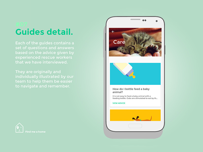
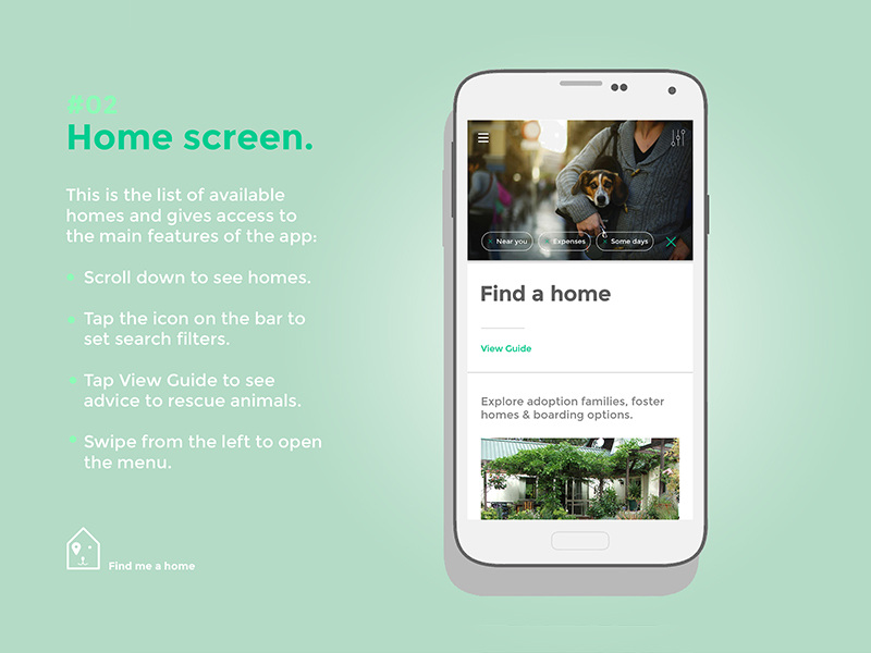
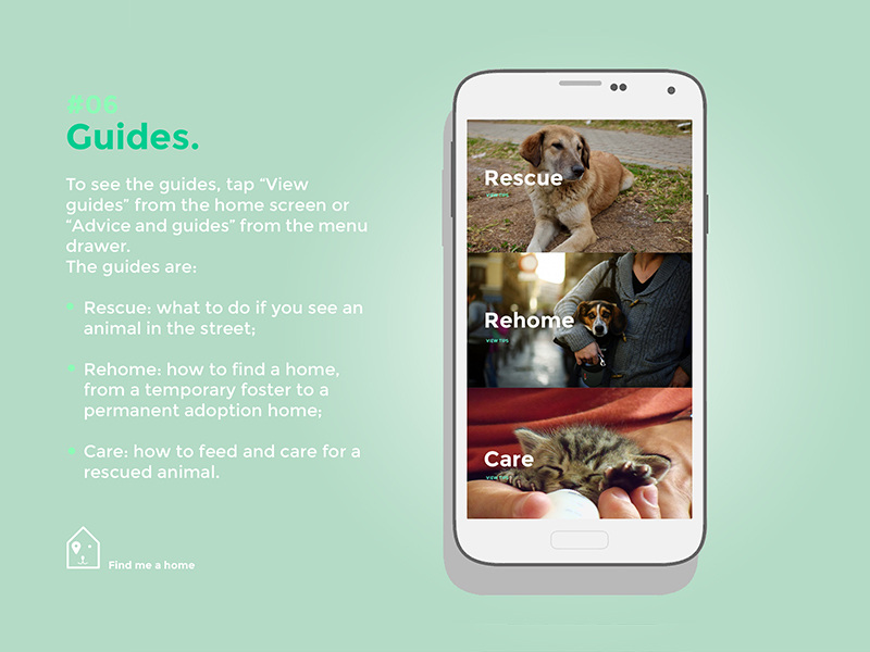
01 Product design: The app screens and functions
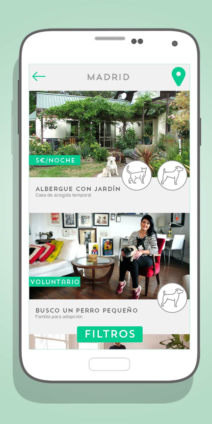
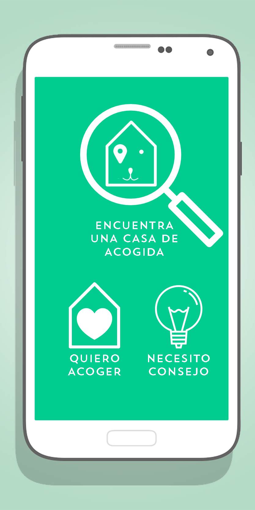
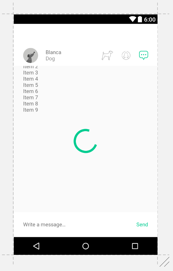
Find me a home is an app that connects people who want to take care of an animal with people who have an animal and need someone to care for it.
The app has three main user interaction possibilities:
1) as a user who has a an animal and is browsing available home listings
2) as a user who offers their home
3) as a user who needs support taking care of an animal they just found in the street
This kind of prototype is useful for designing the product and discussing features with developers before a high-fidelity mock-up.
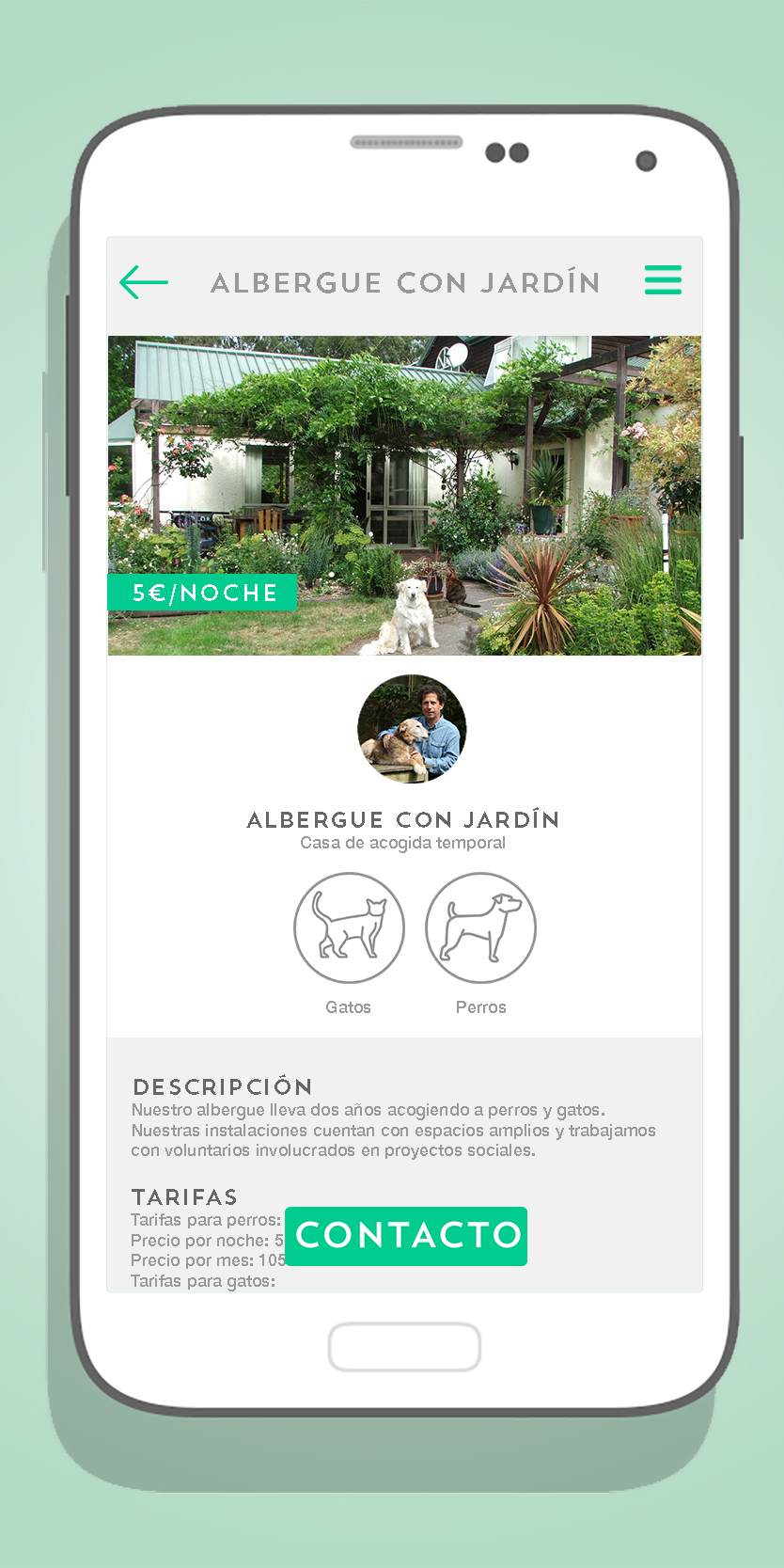
A hi-fi (high fidelity) mockup created in Illustrator.
XML Layout view in Android Studio. When rendered in the compiled app, this layout results in the exact same design as the one on the left.
A hi-fi (high fidelity) mockup created in Sketch.
XML Layout view in Android Studio. Item XMLs are defined separately.
High fidelity prototype designs and their Android native coded version in Android Studio for upcoming features.
To see my code check out my Github profile:
Lucia Tahan on Github — github.com/luciatahan
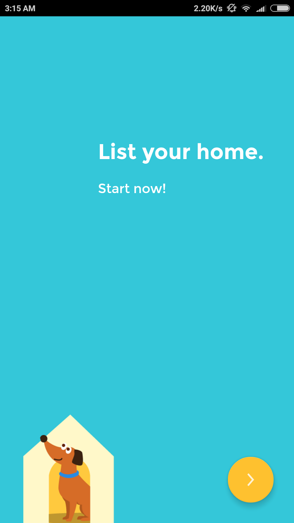
03 UX design case study: An appealing user flow to create a new listing
A traditional way of creating a new profile or listing in many apps is the form, where there is a preset profile/listing interface and the user is prompted to fill or complete their profile/listing. This is often cumbersome and boring and users give up before completing the form.
We wanted to do it better.
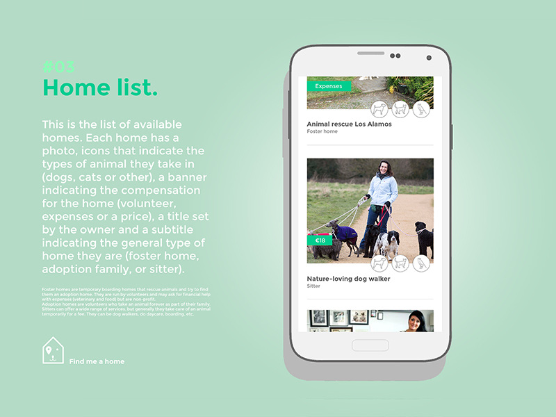
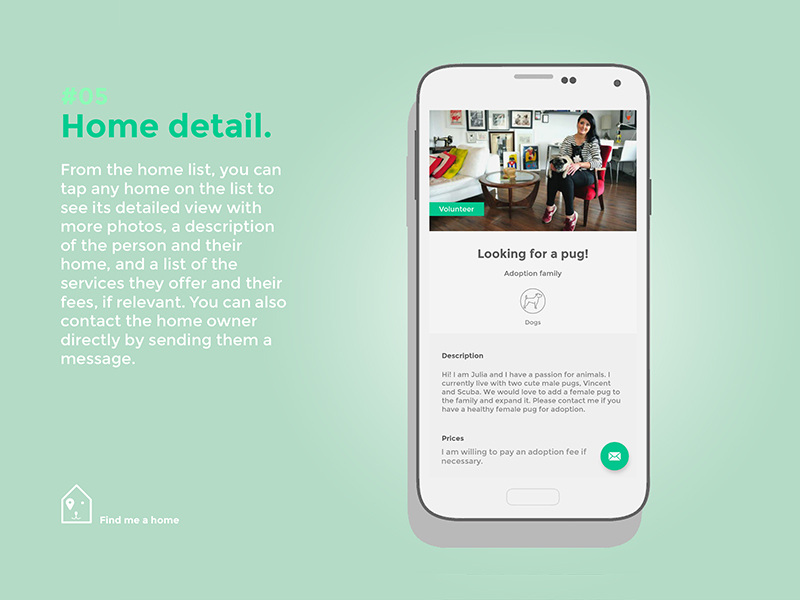
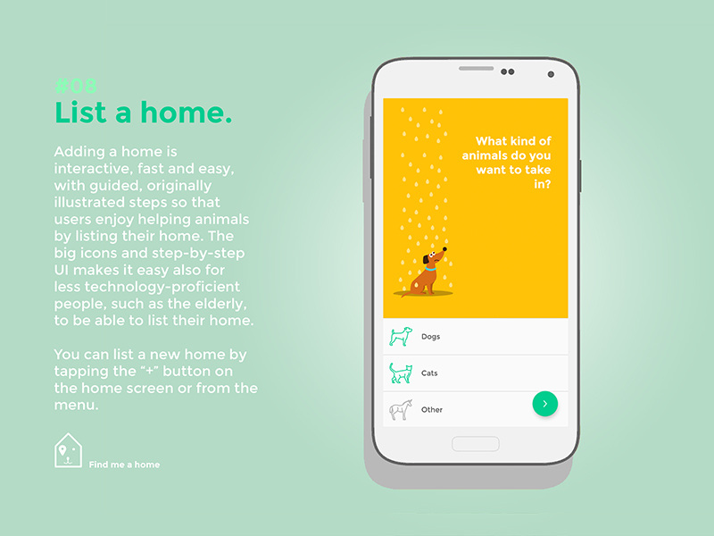
But we also had a unique challenge. We categorize users into three categories: Adoption Families, Foster Homes and Sitters. But just asking people what they wanted to be was going to be confusing, since they may not know the definition of each*. So we designed a conditional questionnaire where we asked simpler questions in an interactive way. Check out the steps below.
To see my code check out my Github profile:
Lucia Tahan on Github — github.com/luciatahan
03 UX design case study: An appealing user flow to create a new listing
A traditional way of creating a new profile or listing in many apps is the form, where there is a preset profile/listing interface and the user is prompted to fill or complete their profile/listing. This is often cumbersome and boring and users give up before completing the form.
We wanted to do it better.
But we also had a unique challenge. We categorize users into three categories: Adoption Families, Foster Homes and Sitters. But just asking people what they wanted to be was going to be confusing, since they may not know the definition of each*. So we designed a conditional questionnaire where we asked simpler questions in an interactive way. Check out the steps below.
Step 1: Onboarding
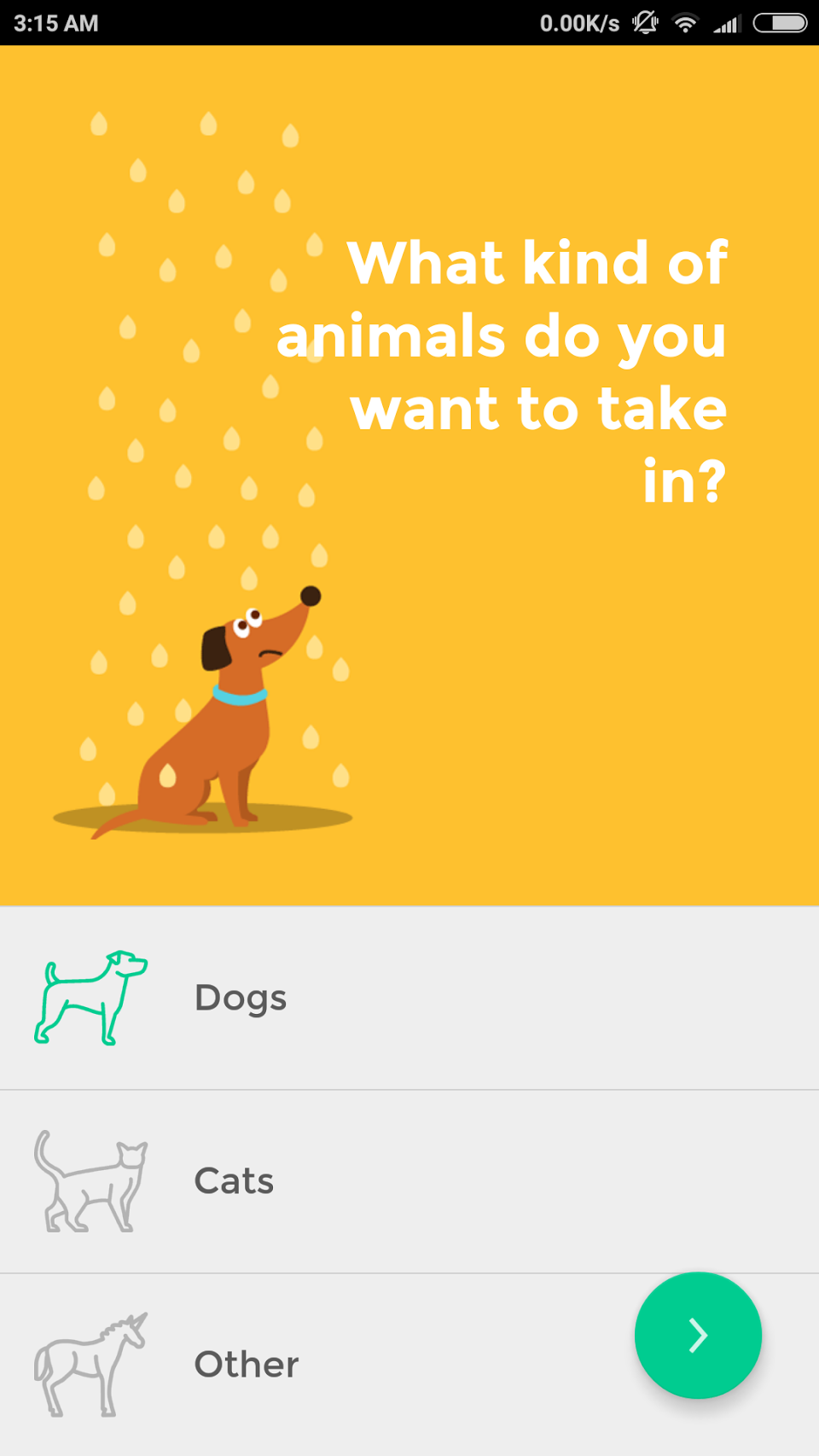
Step 2: Tap to select
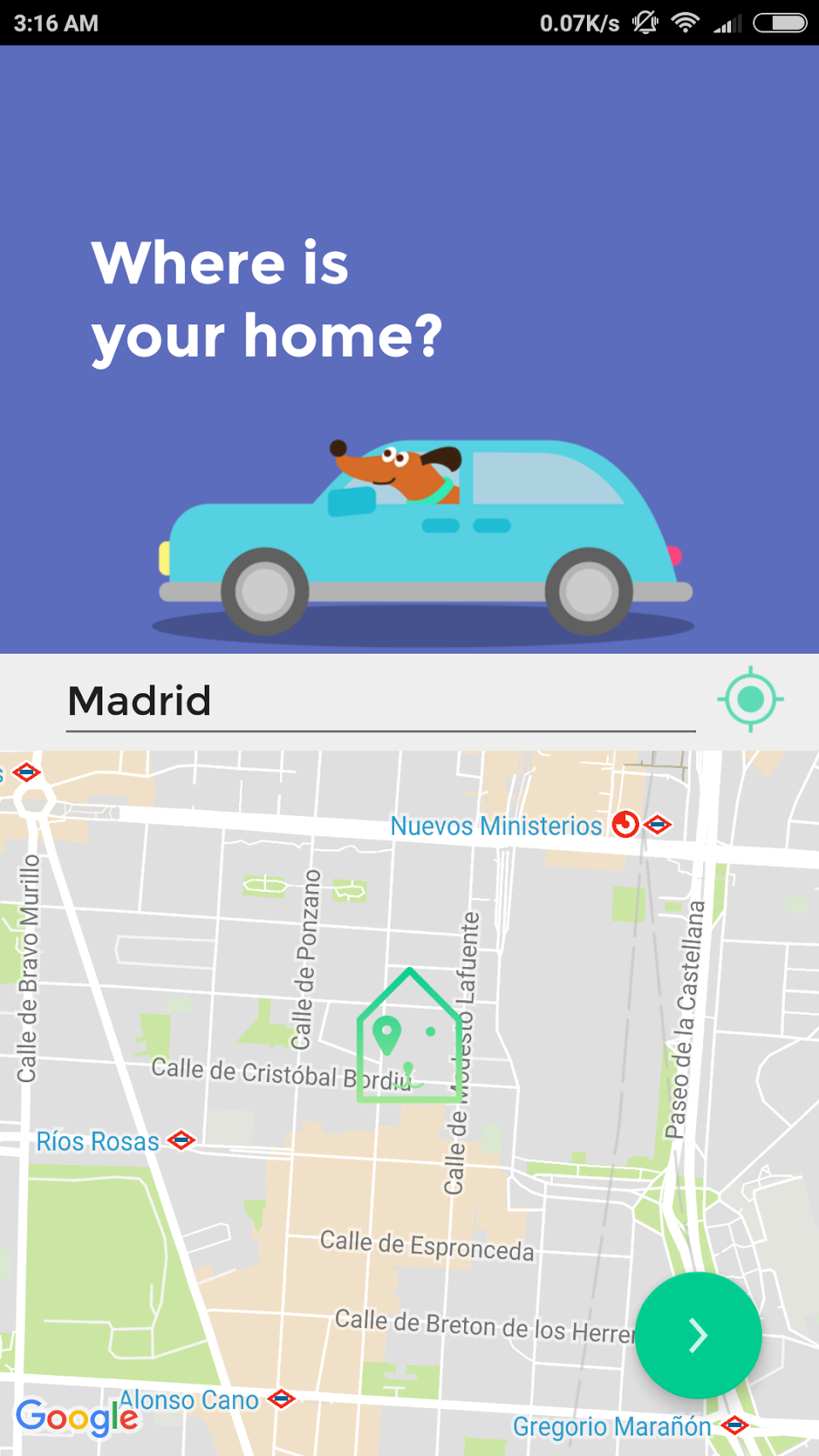
Step 3: GPS-Automated location. If GPS is not enabled, the user is asked for permission to enable it.
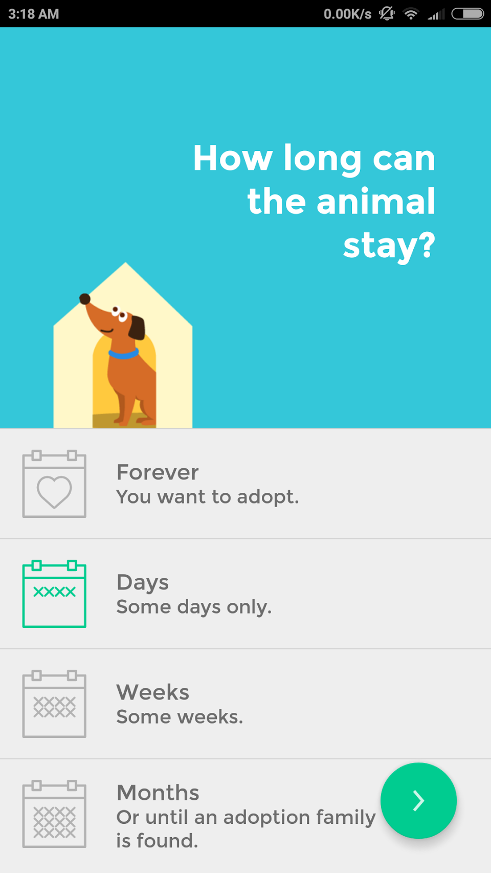 Step 4: This important step covers the complicated difference between a temporary home and an adoption family in a simple way.
If ‘Forever’ is selected, jump to Step 6.
Else proceed to Step 5.
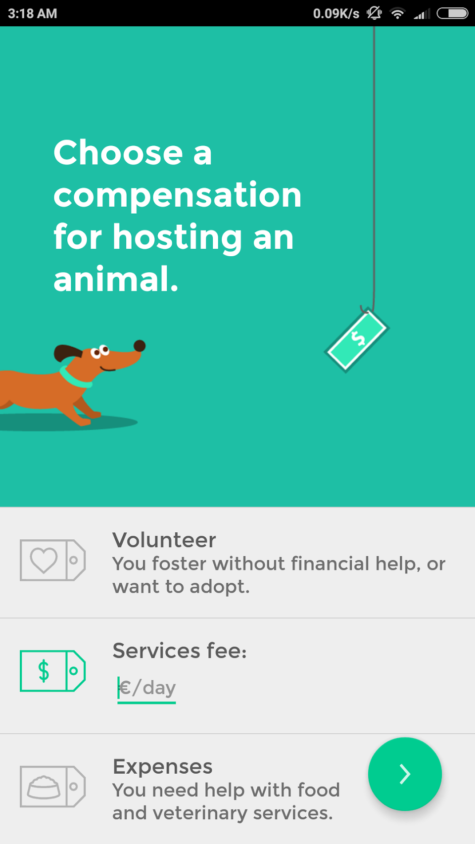 Step 5: This enables us to differentiate between a foster home and a sitter. If requiring compensation, the user inputs a fee.
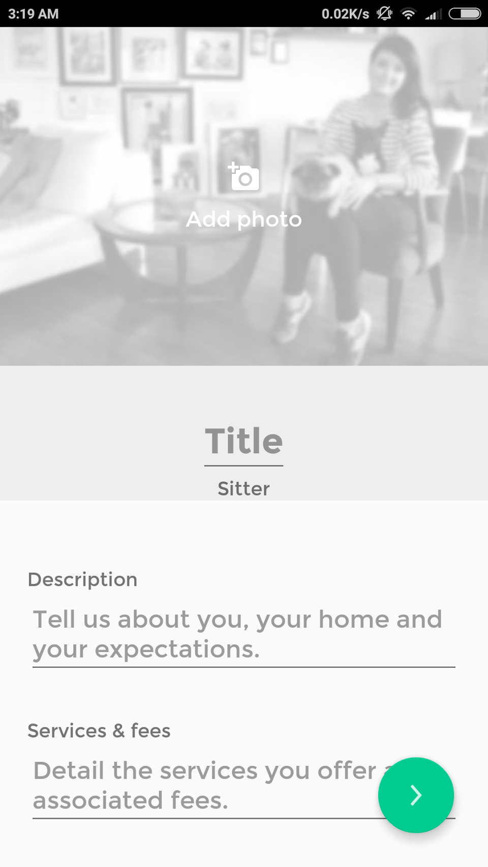 Step 6: Profile preview. Users fill the resulting profile with a photo and description. The blurred photo is a useful cue to the users. The label ‘Sitter’ is automatic depending on the user’s previous choices.
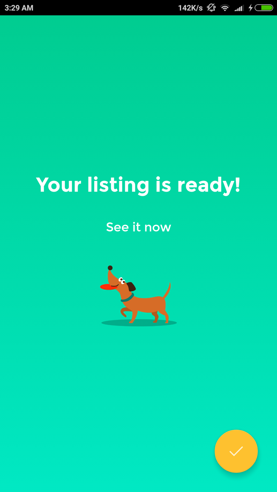 Step 7: Confirmation of success.
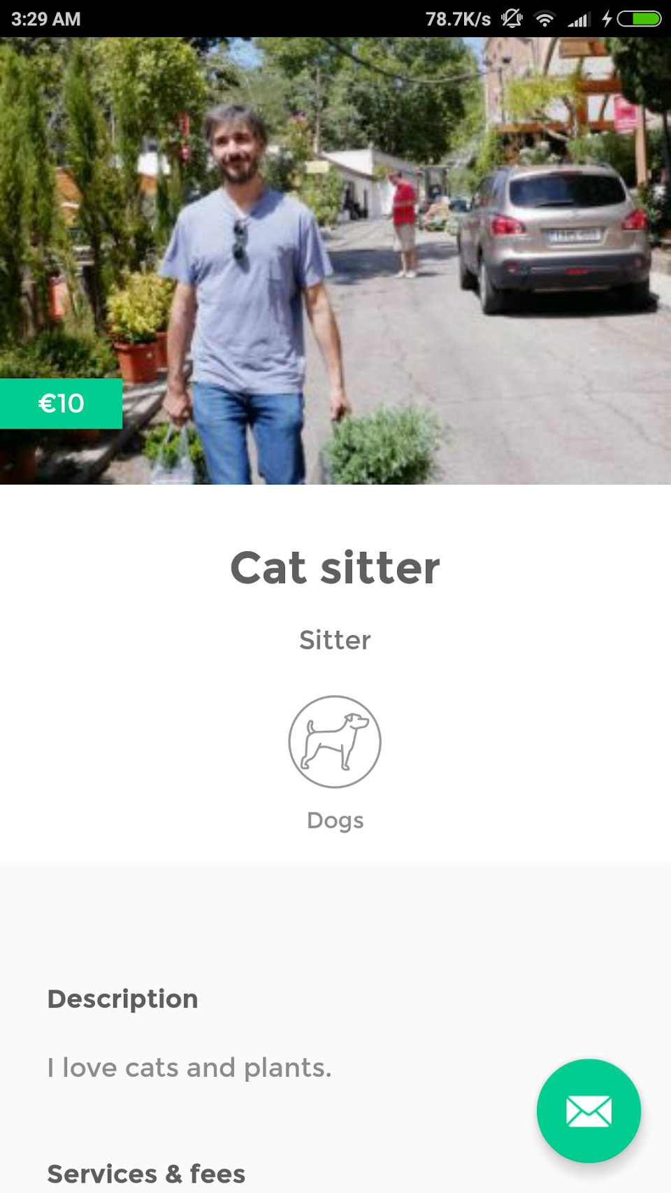 Finished listing.
 *If you have been left wondering, an Adoption Family is someone who wants to take care of animal forever and be a family to it. A Foster Home is anyone who offers to take care of an animal in need for free or for some money to help cover the associated costs, but without a willingness to make money, and for any amount of time (from some days to forever) and who would seek to find another permanent family to it, or anyone who just wants to take care of an animal for some time for fun, to help, or to try and see what it’s like to have a pet before deciding to get one of their own. A sitter is a person who offers to take care of someone else’s pet as a service and charges a fee for it, and they may offer more services like walking dogs, grooming, visits...
UX research interviews I did revealed that if we had asked users to read these definitions and categorize themselves, we would have run into a lot of confusion. After developing this set of carefully-worded questions and turning them into conditional steps, the process has been absolutely successful.
The graphics are all original illustrations made by me to reinforce the points asked.
The color scheme follows Google’s Material Design color guidelines.
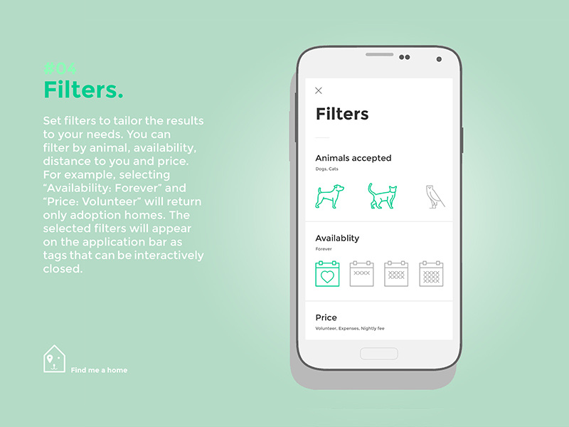
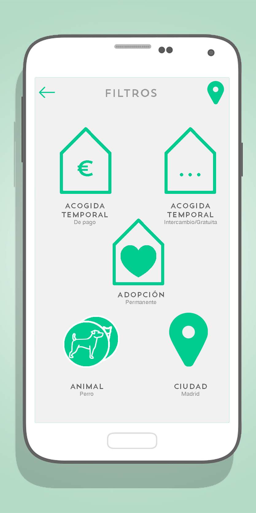
04 UX design case study: Rethinking the search filter screen
Often, filter screens are full of details and lack clarity. They have all kinds of bars and switches and checkboxes and overwhelm the users.
I wanted to design a filter screen that users would like to touch just out of satisfaction. I used only one element: the toggle icon.
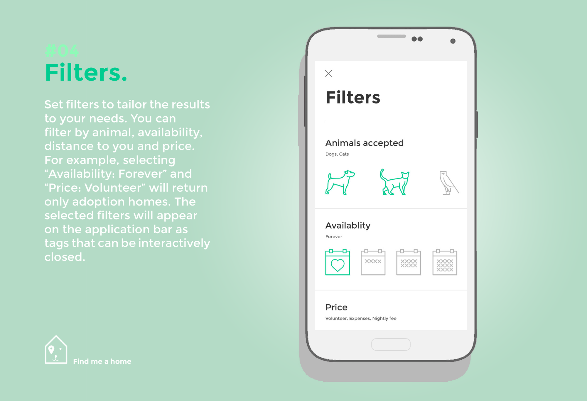
Filtering results is highly visual and intuitive with large toggable icons. To help users, the icon description appears when selected: thus toggling the icon for a dog will make the word ‘dog’ appear and disappear from underneath the title ‘Animals accepted’. This greatly improved the interaction in the tests conducted.
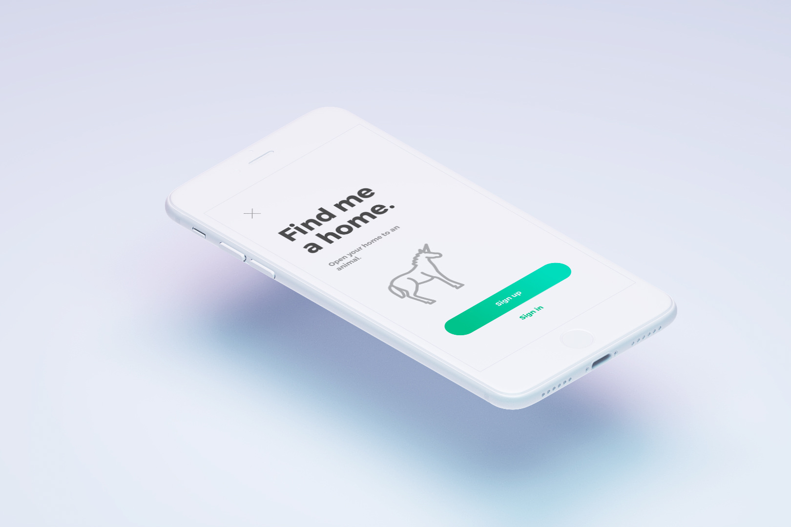
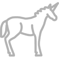
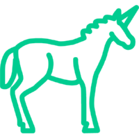
A little anecdote: See that owl next to the cat? Usability tests revealed that users were failing to expect the owl to signify ‘Other animals’. After many iterations I drew a UNICORN and it was an instant success.
‘Other’, disabled
‘Other’, enabled
Often, filter screens are full of details and lack clarity. They have all kinds of bars and switches and checkboxes and overwhelm the users.
I wanted to design a filter screen that users would like to touch just out of satisfaction. I used only one element: the toggle icon.
A little anecdote: See that owl next to the cat? Usability tests revealed that users were failing to expect the owl to signify ‘Other animals’. After many iterations I drew a UNICORN and it was an instant success.
‘Other’, disabled
‘Other’, enabled
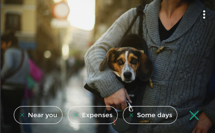
Each tag can be killed individually and thus an X closing mark signals this to the user. The X is too tiny, so tapping anywhere on the tag (not just the X) will kill the tag, but users will be fooled to believed that they aimed correctly at the little X.
When returning to the home screen, active filters are visible in a horizontal-scroll list. The devil’s in the detail, so here I was very careful to design this layer of information in a way that would not be intrusive but rather reflect its level in the hierarchy of information: while useful and reassuring, it is not among the top-level UI elements of this screen.
You can get the app on:
Download Find me a home for Android — Google Play Store