Global Help Center
Foodora and Foodpanda’s Global Help Center was kickstarted independently by me and iterated through direct CEO feedback and user testing.
—
The first step was to create hand-drawn wireframes. I showed them to devs and crossed out many of them because of technical limitations.
Once the technical limitations had been set, I did visual wireframes and again reduced the scope, but was able to agree on two phases of development.
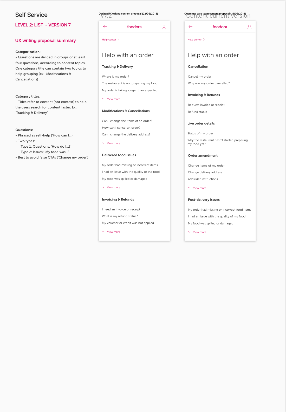
The first version of the Help Center was then moved to visuals and I presented it to stakeholders, together with guidelines on how to structure content. A lot of feedback was received about the content, and I stepped in as a UX writer to collaborate with the Customer Service team.
After several design reviews, a visual mobile version seemed riped for testing. I tested two different versions that had different UX writing styles and different CTAs in a guerrilla session in Berlin.
The conclusions extracted made validate the riskier CTA style, and also discovered some UX issues.
I then developed an updated version based on the user testing results. I also wrote a UX writing guideline for the content team, to ensure that the style and also the formats they would work with were aligned with dev expectiations.
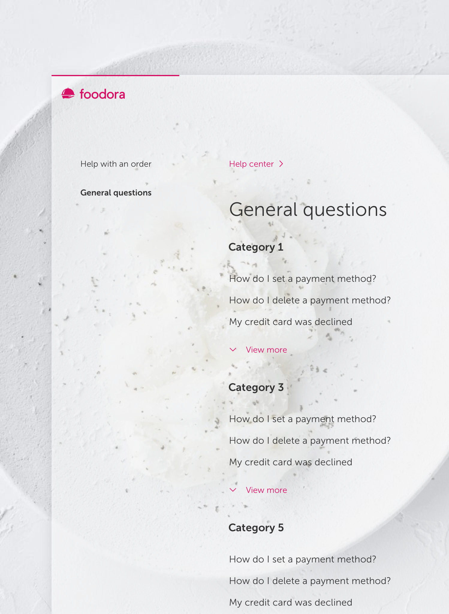
I designed the desktop web version, which was also iterated through design review feedback.
Finally, I produced the specs for development and aligned very closely with the frontend engineer all along the styling process.
—
The first step was to create hand-drawn wireframes. I showed them to devs and crossed out many of them because of technical limitations.
Once the technical limitations had been set, I did visual wireframes and again reduced the scope, but was able to agree on two phases of development.
The first version of the Help Center was then moved to visuals and I presented it to stakeholders, together with guidelines on how to structure content. A lot of feedback was received about the content, and I stepped in as a UX writer to collaborate with the Customer Service team.
After several design reviews, a visual mobile version seemed riped for testing. I tested two different versions that had different UX writing styles and different CTAs in a guerrilla session in Berlin.
The conclusions extracted made validate the riskier CTA style, and also discovered some UX issues.
I then developed an updated version based on the user testing results. I also wrote a UX writing guideline for the content team, to ensure that the style and also the formats they would work with were aligned with dev expectiations.
I designed the desktop web version, which was also iterated through design review feedback.
Finally, I produced the specs for development and aligned very closely with the frontend engineer all along the styling process.
Team:
1 designer, 2 frontend developers, 2 copywriters
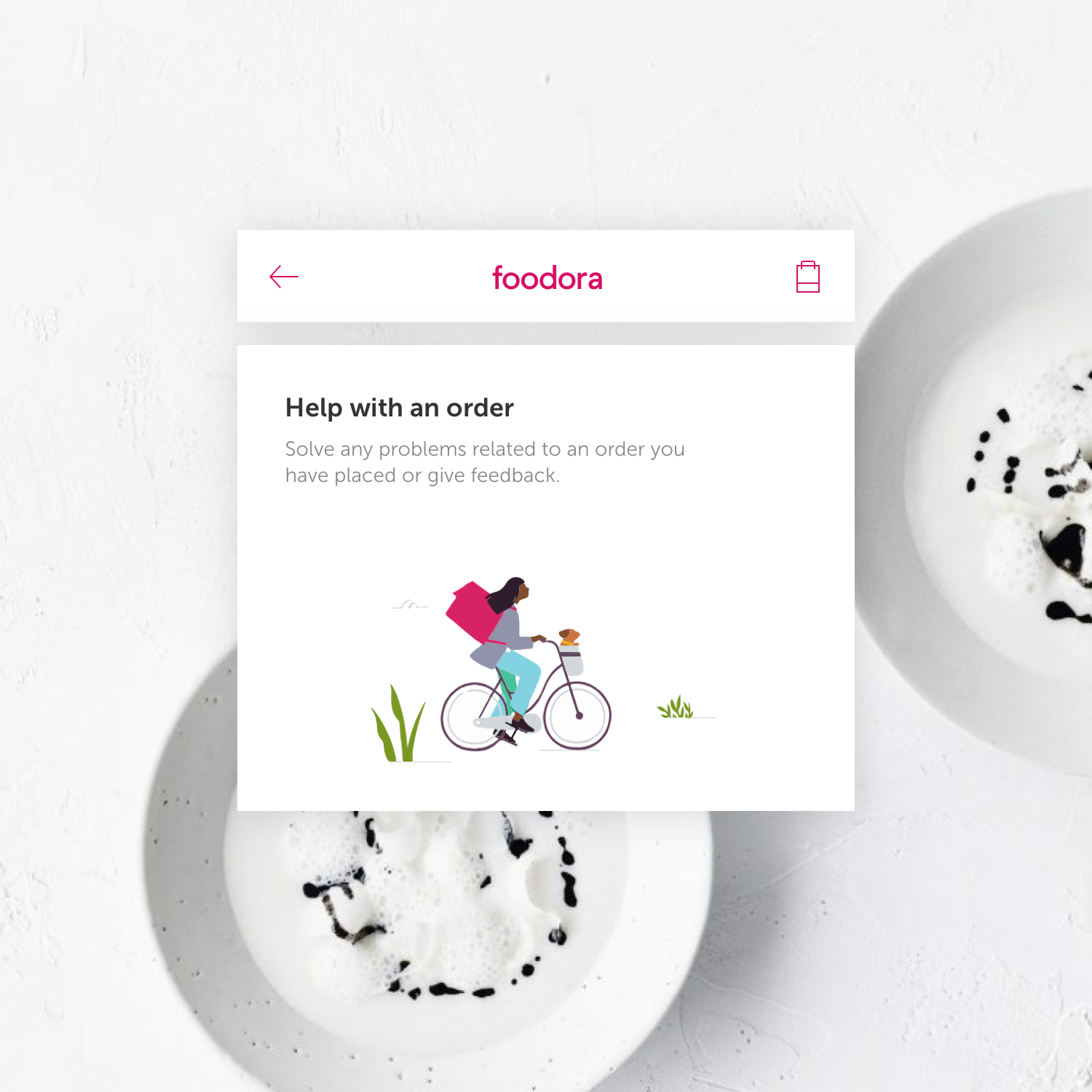
Illustrations:
Stock
1 designer, 2 frontend developers, 2 copywriters
Illustrations:
Stock


WIREFRAMES & PROTOTYPES
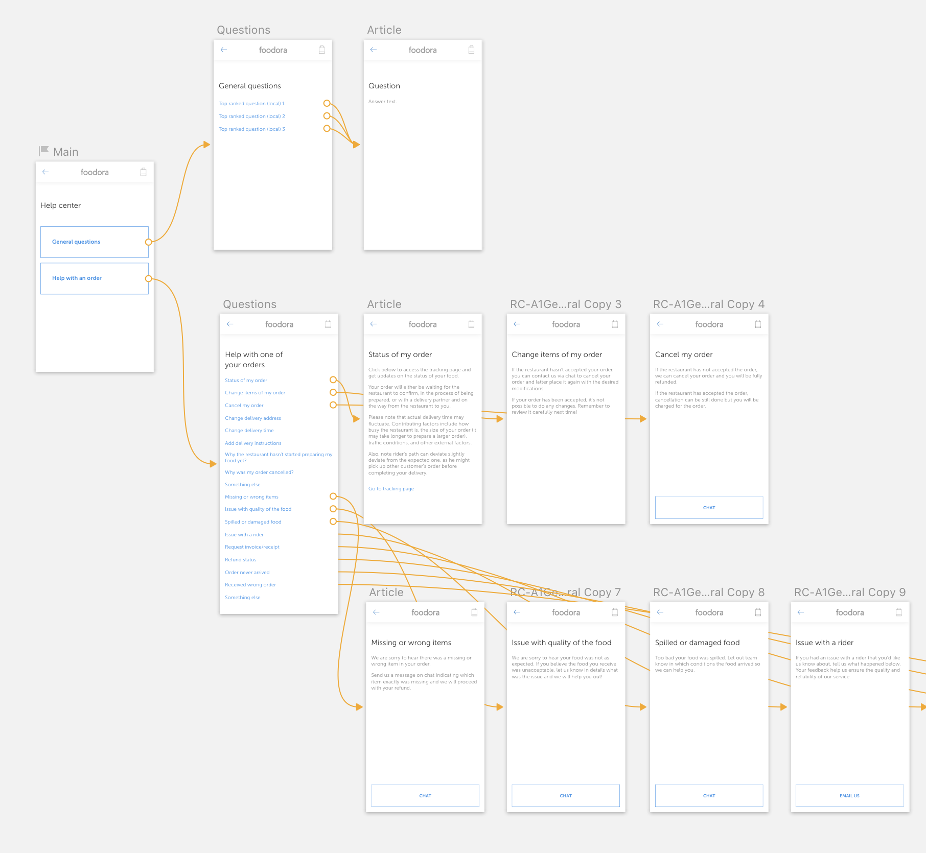 The early wireframe prototype that was used for reaching understanding with developers.
 The two interactive prototypes that I tested with users. Top: clearer CTAs, longer text strings. Bottom: CTA’s as links, shorter questions.
UX WRITING GUIDELINES