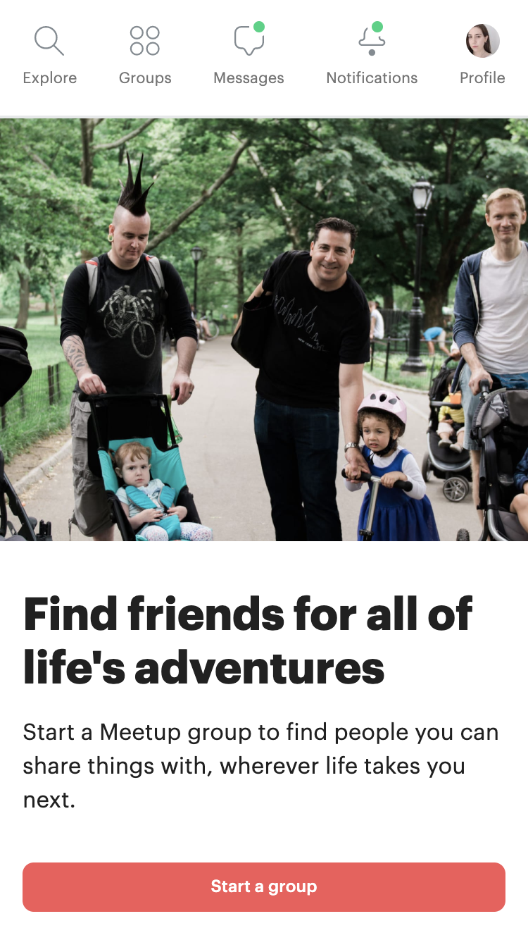
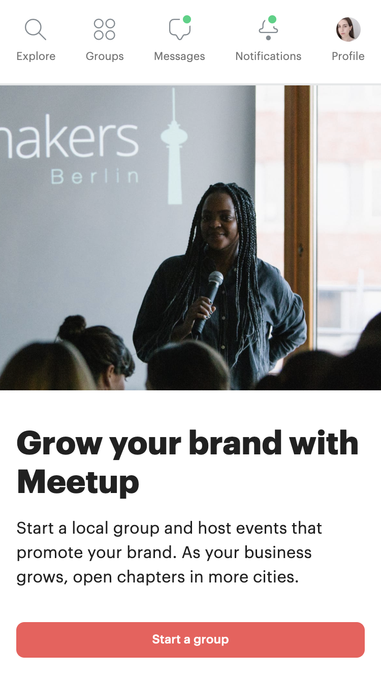
Organizer Pages
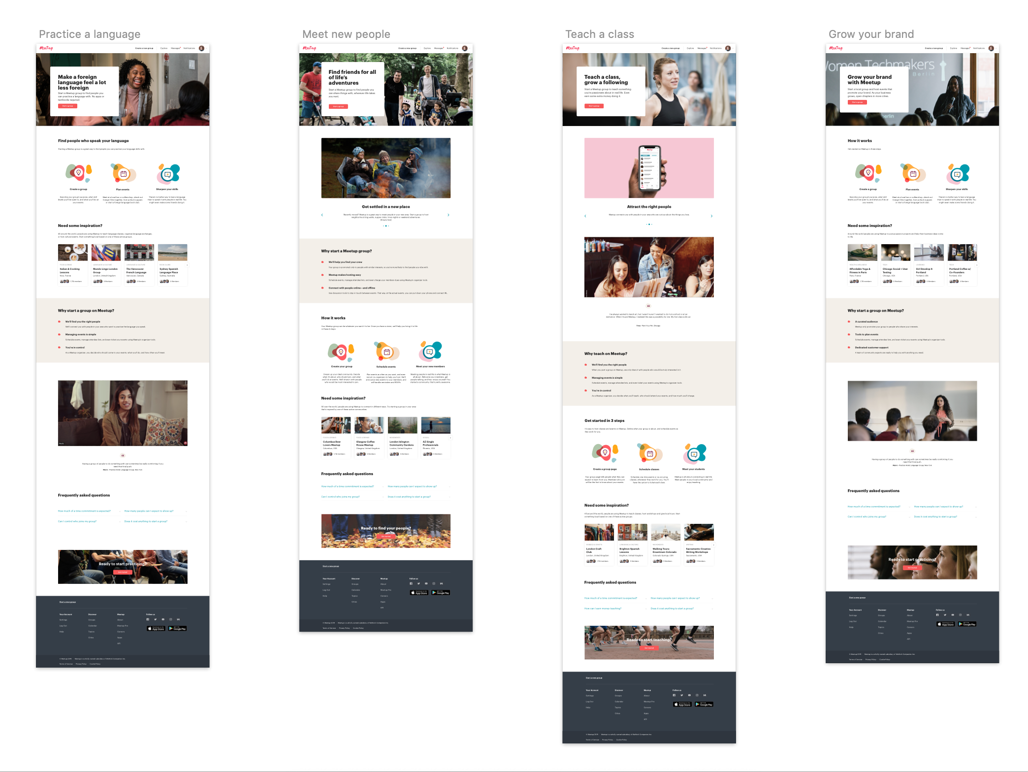
Four pages tailored to the four organizer archetypes at Meetup.
—
Meetup’s main business objective for 2019 was to accelerate growth of its organizer base. Organizers are at the core of Meetup’s business because they create the platform’s content and pay a monthly subscription.
But one key piece of knowledge was missing: what motivates people to start a group on Meetup?
In this project, we created a fast test that proved extremely valuable in three ways:
- It helped us learn who the organizer segments are and what motivates them
- It grew subscriptions by a fantastic 9.7%
- It was loved by organizers who felt inspired by the new content that was tailored for their motivation
Team:
1 designer/PM, 5 developers, 1 content strategist
Status:
Live
1 designer/PM, 5 developers, 1 content strategist
Status:
Live
STRATEGY
This project was part of a series of six experiments to learn about organizer acquisition. I ran a workshop with design and product teams in the New York HQ and then traveled back to the Berlin HQ to complete it with the engineering team. In the workshops, we brainstormed and prioritised experiments following a structure of user problems, opportunities, hypothesis, assumptions and solutions.
 This ‘opportunities tree’ is the result of two consecutive workshops with product and engineering in two cities.
One of the resulting prioritised experiments was the Organizer Pages. It follows this structure in the tree:
User problem: People are not sure what Meetup provides for organizers.
Opportunity: Communicate what Meetup is for.
Hypothesis: If Meetup shows content tailored to a user’s motivation, they will be more likely to start a group.
Solution: Speak to the users about starting a group according to their motivation.
Risks: Users may not have a pre-defined motivation / The motivations may be unknown to Meetup.
Experiment: Create a series of pages with content about the different motivations to start a group, one per motivation.
APPROACH
Qualitative UX research showed that the main organizer segments corresponded to these four organizer archetypes:
Archetype
Socialite
Hobbyist
Entrepreneur
Influencer
Socialite
Hobbyist
Entrepreneur
Influencer
Motivation
Wants to meet people with similar interests
Wants to do an activity
Runs a business on Meetup
Wants to grow their brand and reach an audience
Wants to meet people with similar interests
Wants to do an activity
Runs a business on Meetup
Wants to grow their brand and reach an audience
Example Meetup groups
Parenting groups, social groups
Sports groups, language learning
Classes, workshops
Tech talks, product promotions
Parenting groups, social groups
Sports groups, language learning
Classes, workshops
Tech talks, product promotions
We therefore decided to run the experiment targeting these four motivations.
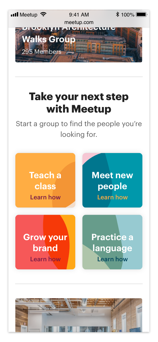
Meetup’s main search page showing the entry points for each motivation.
IMPLEMENTATION STRATEGY AND TIMELINE
The experiment needed to be launched fast in order to validate or refute the hypothesis without slowing the team. The project was successfully completed in one month.
There were three main agents involved:
Design, engineering, and the content strategist.
Because the content itself would need marketing and stakeholder approval, the content was to be finalised later.
The strategy I devised was to create a series of modules that could adapt to different content and be shuffled to create the four distinct pages. This removed content strategy as a blocker, made the whole project more adaptable to future content changes, and greatly simplified engineering effort by reducing four entire pages to only one set of modules.
A MODULAR APPROACH
I defined seven distinct modules that could be shuffled and filled with different content, tailored to each of the pages. This work unblocked both the engineering and content strategy teams: engineers could develop these modules independently, and content strategy could use them as building blocks to formulate the messages for organizers.
 Header
 Testimonials
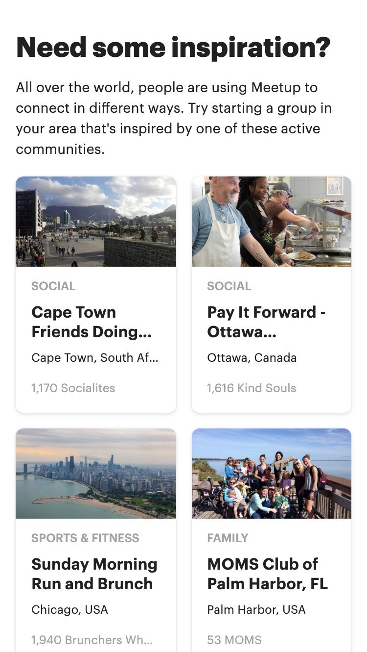 Inspiring curated groups
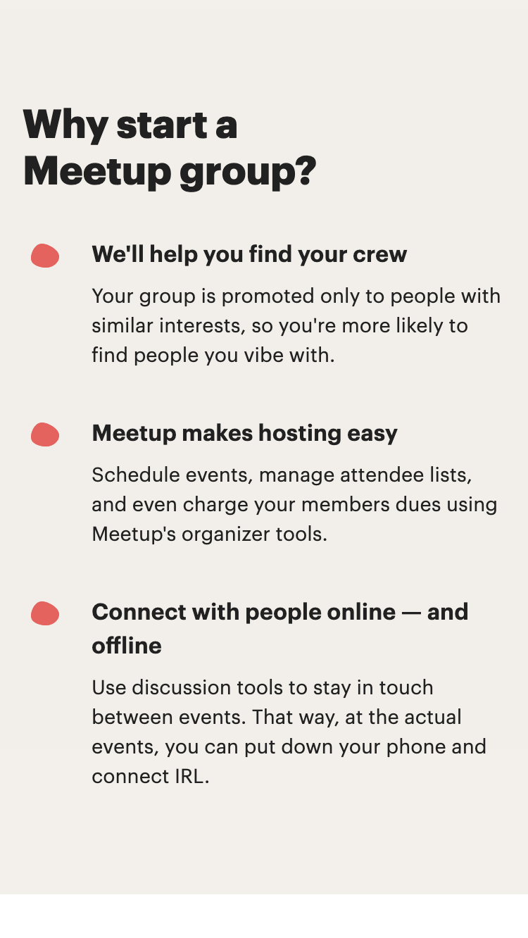 Meetup’s value prop
 How Meetup works
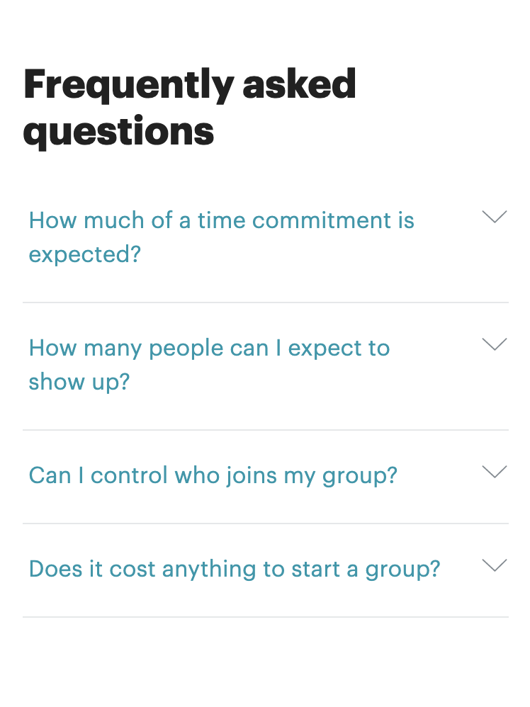 FAQ
FAQ
 Footer
THE FOUR PAGES
BUSINESS IMPACT: A HUGE INCREASE IN SUBSCRIPTIONS
The pages were launched as a split test in the US. We saw a 9.7% increase in conversions from user to organizer from Meetup’s homepage. This is a huge differential, and it got Meetup closer to being able to claim double-digit growth in subscriptions. Of all efforts to acquire new subscribers across marketing and product departments, this one was recognised as the most efficient and impactful.

9.68% lift in group starters (users who subscribed to create a new Meetup group)
QUANTITATIVE USER RESEARCH
The experiment provided very valuable data to understand Meetup’s organizer motivations. I performed the following data analysis to gather insights.
An interesting discovery was that business-oriented motivations had a much higher conversion ratio.
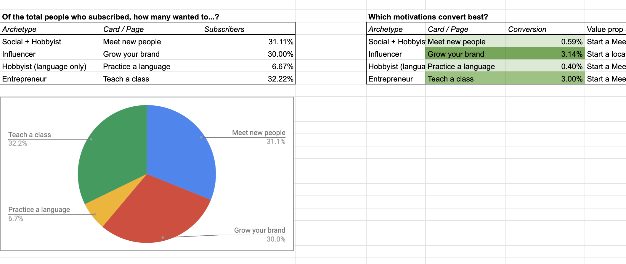 Data anaysis: conversion rates by motivation
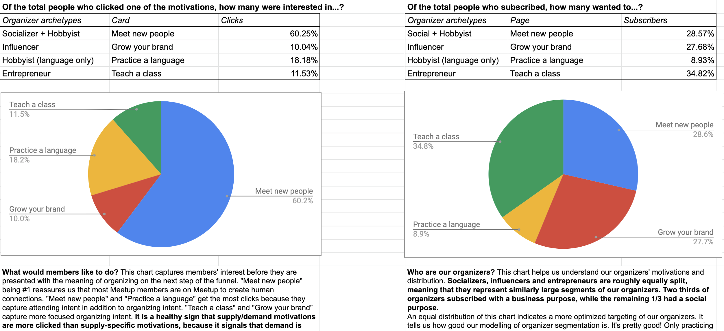 Data analysis: Interest vs conversion
6 MONTHS LATER
After the test, the pages were expanded to 100% of users and translated to be launched internationally. They are now a core part of the Meetup product.
The UX research team ran user interviews to learn more about how the pages were helping people create groups and iterate on content and uncover UX issues. One user who had started a support group for people with bipolar disorder mentioned how seeing the page for ‘Meet new people’ had helped him imagine what his group would look like. He mentioned that the pictures and text described a sense of community and safe space. He therefore he had chosen Meetup over other platforms to run his events.
Other teams assigned to acquisition used the learnings from this experiment to create a universal landing page for organizers.
This experiment is also creating data for an improved Machine Learning model for search and discovery. Knowing the organizer motivation when creating a group helps the algorithm make better recommendations to users who are looking for groups and events.
