TFS Product

Tools for Show required an incredibly strategic and precise design. We had 10k and two weeks from a developer to implement it.
—
The design had to be super simple to develop, impressive to use for our demos, and we didn’t have a second chance to iterate with the developer.
I rose to the challenge and Tools for Show has already captured the attention of the museum and curation world in the US.
Here you can check out the documentation I produced to define the UI and turn the idea of TFS into an actual successful MVP prototype.
Team:
1 CEO, 1 designer
1 CEO, 1 designer
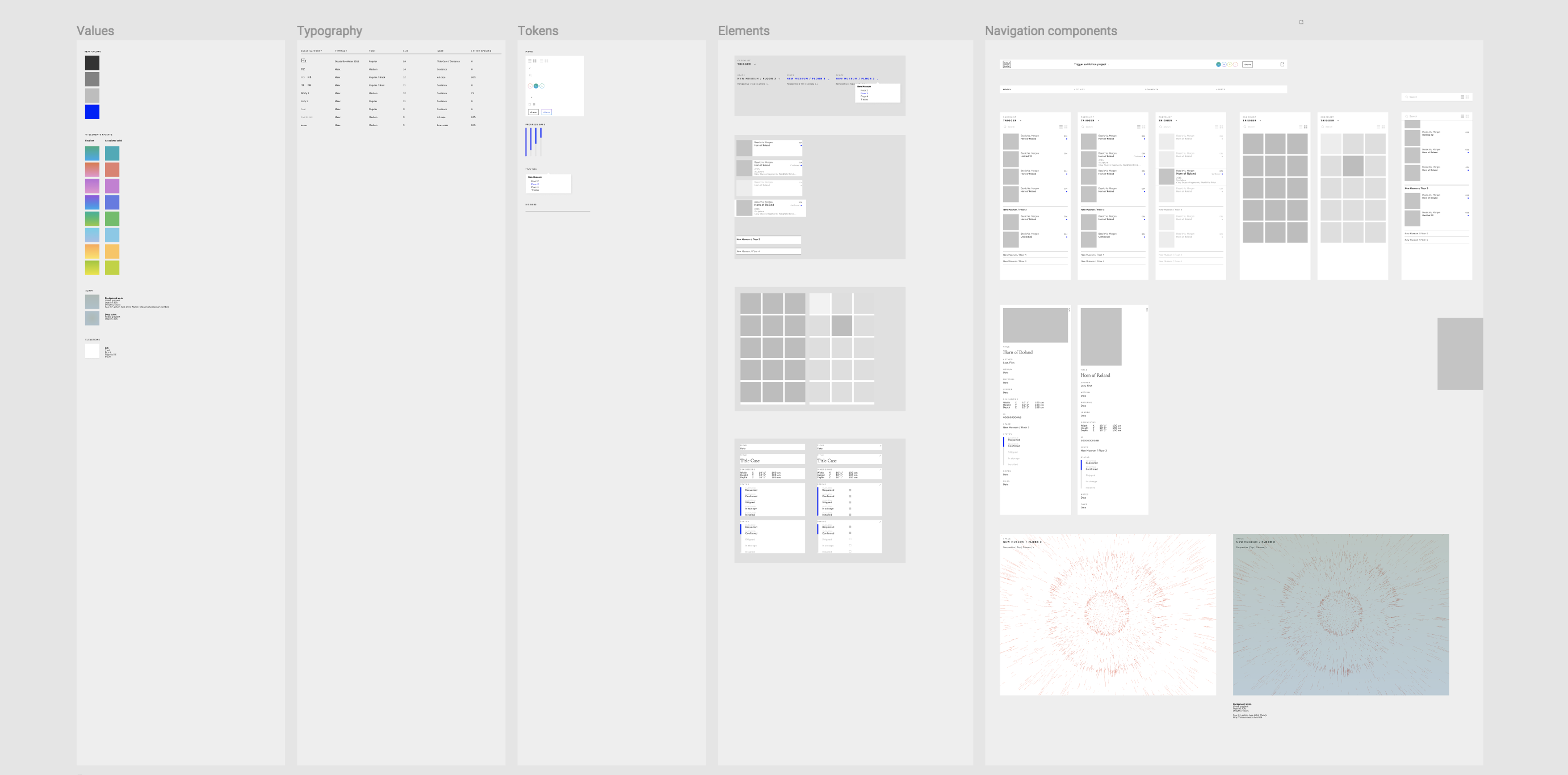
 UI specs. The whole product is based on a few components.
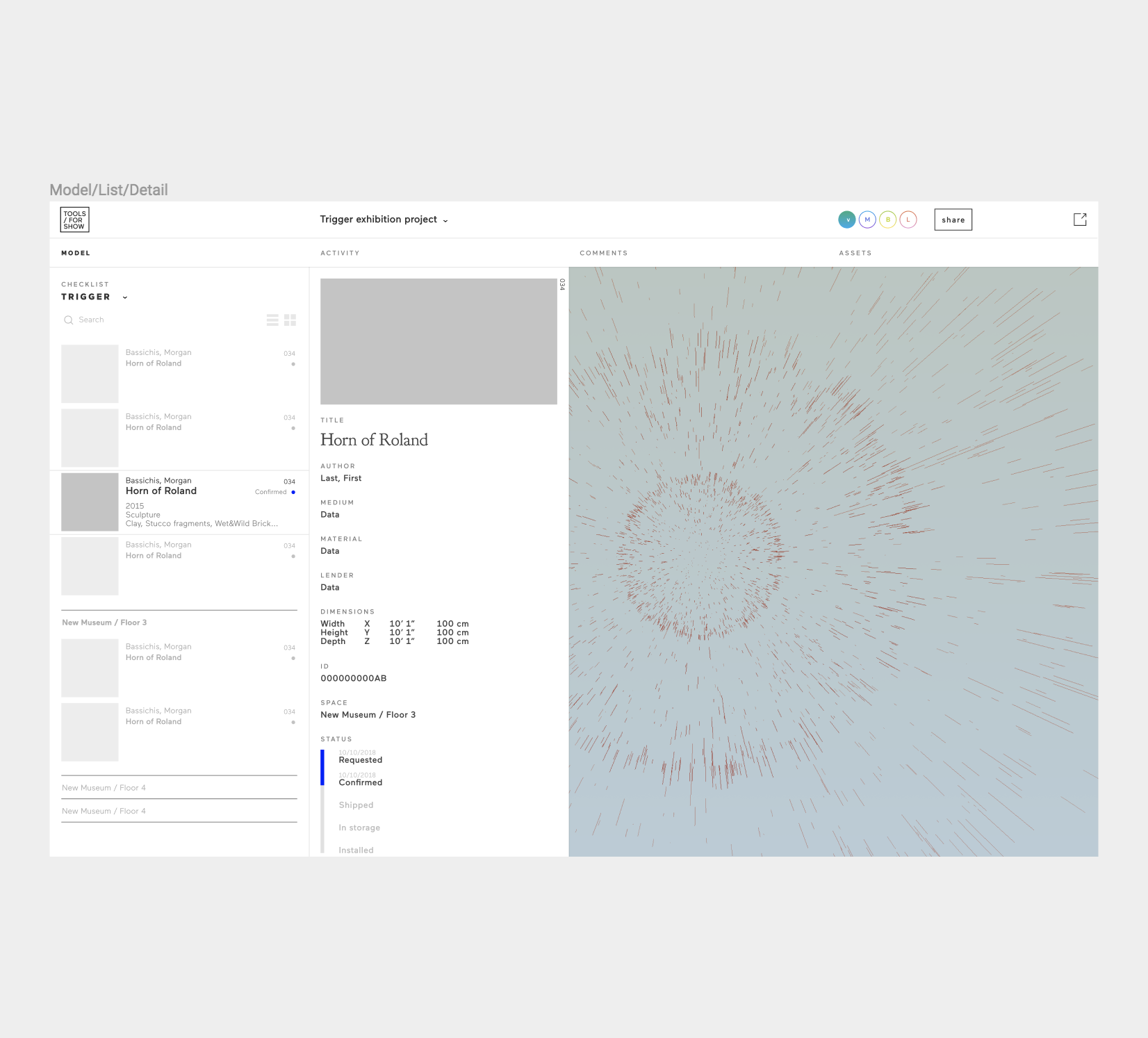
 Prototype screens
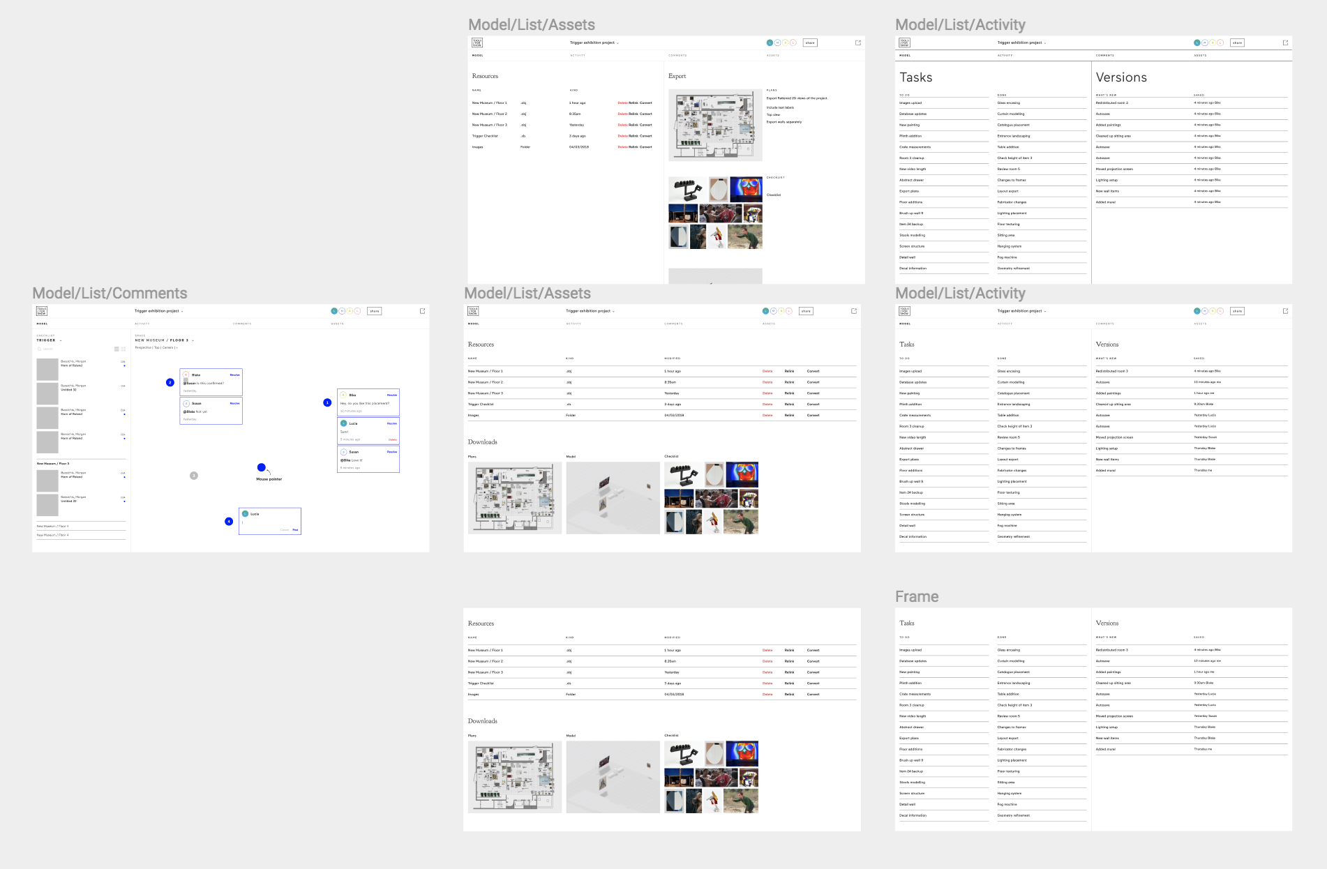
 Dashboard showing loading states
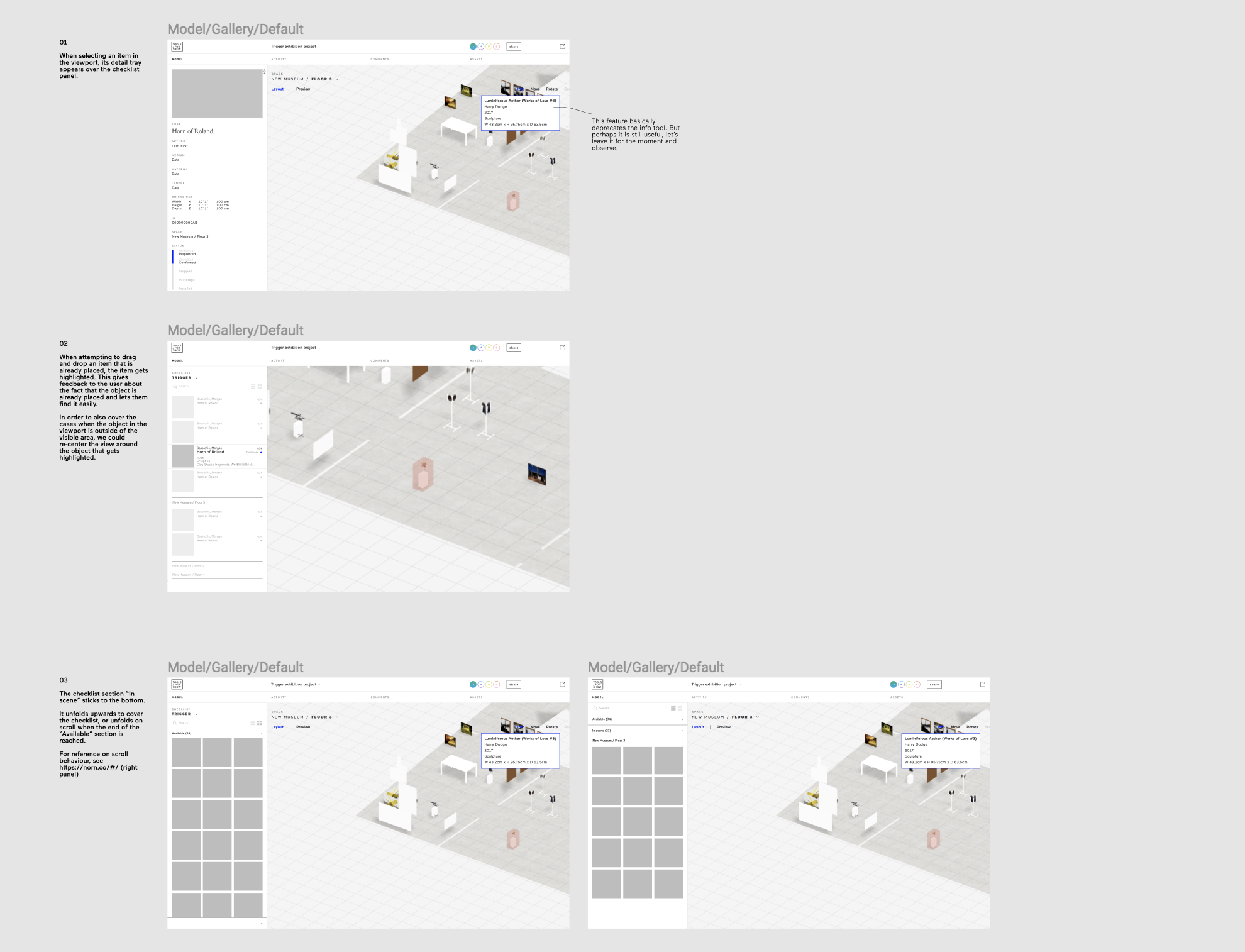
 Explorations and mockups for future features
 Several ideas for improving UX. After we conducted user testing, we realized that the feedback between the viewport and the checklist was not clear enough. Users were also missing the checklist’s sections. I pitched several ways to improve it to both the CEO and the developer and we decided on what would be easier to implement and more strategic for the future.